GÖST Vapor
I created the branding for GÖST Vapor in 2015 as a freelance designer and helped them break into the E-liquid market at the height of its popularity.
Branding to stand out but also to fit in
GÖST Vapor is an E-liquid producer that wanted to build a brand that catered to mature audiences. They wanted something that was sophisticated, stood out from the crowd, and emanated quality.
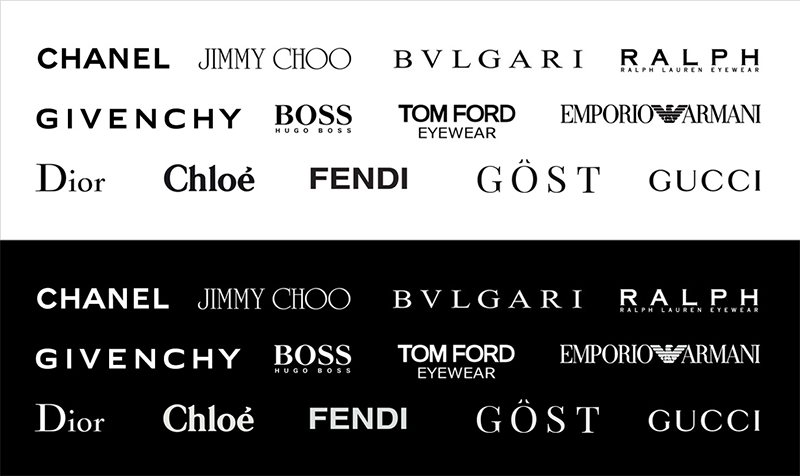
I called upon inspiration I gained from studying logos of designer fashion, expensive cars, and other fancy things and created a logo which had the same style. While it wasn’t my idea to spell the word “Ghost” as “GÖST”, it was my idea to make the umlaut, the marks over the O, look like little ghost eyes (I know, genius, right?). Giving the logo lettering stylistic qualities of its meaning is a pretty common strategy us designers use to make the logo unique and meaningful.
The white letting on the stark black background make the brand powerful and give it a refined feel — think black tie events, tuxedos, little black dresses, you know… fancy stuff.
The way I was able to sell them on their new brand was by putting the logo I created in a collage of designer logos. It showed them that the logo had a similar style and fit in with all of them.
I also worked on several other designs for some introductory products they were marketing. These included digital and print media for their promotional materials and bottle labels.
When my work was complete, GÖST Vapor had a beautiful, handcrafted brand and logo that made them stand out and helped them break into the E-liquid market.

